 asdpasdo
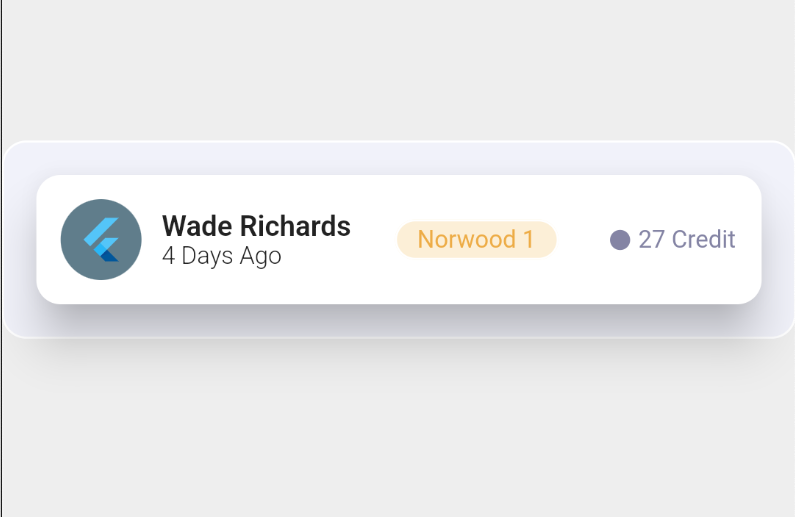
In the world of mobile app development, Flutter has gained immense popularity due to its versatility and ease of use. With Flutter, you can build stunning user interfaces with widgets, and one such widget is the card widget. Cards are an essential component in app design, providing a structured and visually appealing way to present information. In this blog post, we will explore the process of creating captivating cards using Flutter, step by step. Whether you’re a beginner or an experienced developer, this guide will help you master the art of designing cards and elevate your app’s UI to the next level. So, let’s dive in and discover the secrets behind crafting stunning cards in Flutter!

Code:
import 'package:flutter/material.dart';

void main() {
  runApp(const MyApp());
}

class MyApp extends StatelessWidget {
  const MyApp({super.key});

  // This widget is the root of your application.
  @override
  Widget build(BuildContext context) {
    return MaterialApp(
      title: 'Flutter Demo',
      theme: ThemeData(

        primarySwatch: Colors.blue,
      ),
      home: const MyHomePage(title: 'Flutter Demo Home Page'),
    );
  }
}

class MyHomePage extends StatefulWidget {
  const MyHomePage({super.key, required this.title});

  final String title;

  @override
  State<MyHomePage> createState() => _MyHomePageState();
}

class _MyHomePageState extends State<MyHomePage> {
  @override
  Widget build(BuildContext context) {
    return Scaffold(
      backgroundColor: Colors.grey.shade200,
      // backgroundColor: Colors.black,

      body: Center(
        child: Container(
          decoration: BoxDecoration(
            border: Border.all(width: 1.0, color: Colors.white),
            color: Color(0xffF1F2FA),
            borderRadius: BorderRadius.all(
                Radius.circular(12.0) //         <--- border radius here,

                ),
          ),
          child: Padding(
            padding: const EdgeInsets.all(12.0),
            child: Card(
              elevation: 20,
              shape: RoundedRectangleBorder(
                borderRadius: BorderRadius.circular(12.0),
              ),
              child: Padding(
                padding: const EdgeInsets.all(12.0),
                child: Row(
                  mainAxisAlignment: MainAxisAlignment.spaceBetween,
                  children: [
                    ClipRRect(
                      borderRadius: BorderRadius.circular(40.0),
                      child: Container(
                          color: Colors.blueGrey,
                          child: Padding(
                            padding: const EdgeInsets.all(8.0),
                            child: FlutterLogo(),
                          )),
                    ),
                    SizedBox(
                      width: 10,
                    ),
                    Expanded(
                        child: Row(
                      mainAxisAlignment: MainAxisAlignment.spaceBetween,
                      children: [
                        Column(
                          crossAxisAlignment: CrossAxisAlignment.start,
                          mainAxisSize: MainAxisSize.min,
                          mainAxisAlignment: MainAxisAlignment.center,
                          children: <Widget>[
                            Text(
                              'Wade Richards',
                              style: TextStyle(
                                  fontWeight: FontWeight.w600, fontSize: 14),
                            ),
                            Text(
                              '4 Days Ago',
                              style: TextStyle(
                                  fontWeight: FontWeight.w300, fontSize: 12),
                            ),
                          ],
                        ),
                        Container(
                          decoration: BoxDecoration(
                            border: Border.all(width: 1.0, color: Colors.white),
                            color: Color(0xffFFCEFD7),
                            borderRadius: BorderRadius.all(Radius.circular(
                                    12.0) //         <--- border radius here,

                                ),
                          ),
                          child: Padding(
                            padding: const EdgeInsets.symmetric(
                                horizontal: 10, vertical: 2),
                            child: Text(
                              "Norwood 1",
                              style: TextStyle(
                                  color: Color(0xffEDAC46), fontSize: 12),
                            ),
                          ),
                        ),
                        Row(
                          children: [
                            Padding(
                              padding: const EdgeInsets.all(3.0),
                              child: Icon(
                                Icons.circle,
                                size: 12,
                                color: Color(0xff8484A4),
                              ),
                            ),
                            Text(
                              "27 Credit",
                              style: TextStyle(
                                  fontWeight: FontWeight.w400,
                                  color: Color(0xff8484A4),
                                  fontSize: 12),
                            ),
                          ],
                        )
                      ],
                    ))
                  ],
                ),
              ),
            ),
          ),
        ),
      ),
    );
  }
}
link github
The given code represents a Flutter widget hierarchy that creates a centered card with a specific design and layout. Here’s a breakdown of the code:
Center: This widget centers its child widget horizontally and vertically on the screen.Container: It is a widget used to contain and style other widgets. In this case, it defines the appearance of the card.decoration: Specifies the visual decoration of the container, including a border, background color, and border radius.border: Creates a border around the container with a width of 1.0 and white color.color: Sets the background color of the container to a specific shade (0xffF1F2FA).borderRadius: Defines the rounded corners of the container with a radius of 12.0.
child: The child of the container, which contains the content of the card.
Padding: Adds padding around the child widget within the container.EdgeInsets.all(12.0): Sets equal padding of 12.0 pixels on all sides of the child widget.Card: Represents a material design card with a shadow and rounded corners.elevation: Sets the shadow depth of the card to 20.shape: Specifies the shape of the card with rounded corners usingBorderRadius.circular(12.0).child: The child of the card, which contains the content of the card.
Padding: Adds padding around the child widget within the card.EdgeInsets.all(12.0): Sets equal padding of 12.0 pixels on all sides of the child widget.Row: Arranges its children widgets in a horizontal row with space between them.mainAxisAlignment: Aligns the children widgets along the horizontal axis with space evenly distributed between them.children: Contains a list of widgets that represent the content of the card.ClipRRect: Clips the child widget to a rounded rectangle shape.borderRadius: Sets the border radius of the clipped container to 40.0.Container: Contains a blue-grey colored container with padding.color: Sets the background color of the container to blue-grey.Padding: Adds padding around the child widget within the container.EdgeInsets.all(8.0): Sets equal padding of 8.0 pixels on all sides of the child widget.FlutterLogo: Displays the Flutter logo as the content of the container.
SizedBox: Creates an empty box with a specific width.width: Sets the width of the box to 10 pixels.
Expanded: Allows the row to occupy the remaining horizontal space.Row: Arranges its children widgets in a horizontal row with space between them.mainAxisAlignment: Aligns the children widgets along the horizontal axis with space evenly distributed between them.children: Contains a list of widgets that represent the content of the row.Column: Arranges its children widgets in a vertical column.crossAxisAlignment: Aligns the children widgets along the horizontal axis to the start.mainAxisSize: Takes the minimum amount of vertical space necessary to contain its children.mainAxisAlignment: Aligns the children widgets along the vertical axis to the center.children: Contains a list of widgets that represent the content of the column.Text: Displays the text “Wade Richards” with a specific font style (bold) and size (14).Text: Displays the text “4 Days Ago” with a specific font style (light) and size (12).
Container: Contains a colored container with padding.decoration: Specifies the visual decoration of the container, including a border, background color, and border radius.border: Creates a border around the container with a width of 1.0 and white color.color: Sets the background color of the container to a specific shade (0xffFFCEFD7).borderRadius: Defines the rounded corners of the container with a radius of 12.0.
Padding: Adds padding around the child widget within the container.EdgeInsets.symmetric(horizontal: 10, vertical: 2): Sets horizontal padding of 10.0 pixels and vertical padding of 2.0 pixels on the child widget.Text: Displays the text “Norwood 1” with a specific font color (0xffEDAC46) and size (12).
Row: Arranges its children widgets in a horizontal row.children: Contains a list of widgets that represent the content of the row.Padding: Adds padding around the child widget within the row.EdgeInsets.all(3.0): Sets equal padding of 3.0 pixels on all sides of the child widget.Icon: Displays a circle-shaped icon with a specific size (12) and color (0xff8484A4).
Text: Displays the text “27 Credit” with a specific font style (normal), color (0xff8484A4), and size (12).
By using the provided code, you can create a visually appealing card with various elements arranged in a specific layout within a Flutter app.